
I love maps and statistics like this … this map shows how the country has changed over the past twenty years. Each county is color coded for how the county changed racially — a very red county means that the county’s new residents were overwhelmingly white, and a very blue county went overwhelmingly non-white.
This is important for elections in that it shows how the minority-heavy districts (which tend to be more Democratic) can change places like Virginia. It also shows something bad for Democrats in that they are tending to concentrate in the urban areas, making the rural areas even more white and Republican than they had previously been.
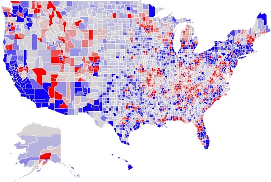
Anyway, there is a very good analysis of this here. There is also an interactive map where you can zoom in and check on your county. You can click on each county and see the county’s population change. For instance, take Monroe County, Pennsylvania, where I live, just over the New Jersey border. It went hugely blue over the last twenty years and added about 17,000 new residents.
Please do not be scared away by the fact that this is from a liberal blog — the information is presented clearly and without bias, and contains information that is interesting to anyone who likes these kinds of statistics.
